ERROR404.NET
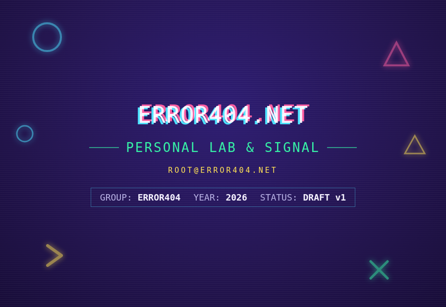
Personal brand guidelines — 90s warez-scene ASCII, arcade neon, and new-wave hacker, carried across the lab, the web presence, and everything printed.
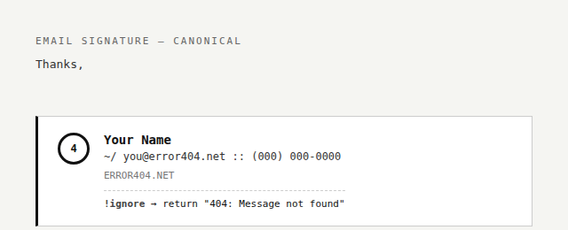
!ignore → return "404: Message not found"
Personal brand guidelines — 90s warez-scene ASCII, arcade neon, and new-wave hacker, carried across the lab, the web presence, and everything printed.
ACiD/iCE-style ANSI group logos and boxed .NFO release tables, CRT/VHS chromatic-aberration
glitch text, 80s–90s arcade cabinet neon geometry, phone-phreaking iconography as a texture accent. Avoid corporate
SaaS gradients, soft rounded cards, and any "clean flat design" pass that sands off the CRT/ANSI texture — the texture
is the brand.
One background, one foreground, max two accents per surface. Each accent keeps a fixed meaning rather than swapping per surface.
Full wordmark ERROR404.NET anywhere the brand is named. Icon-only mark drops to the bare numeral 404 (or 4 at the smallest sizes) — standard practice, not an inconsistency.

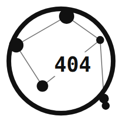
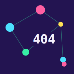
A node-link network graph built from the real Libra constellation (the scales) — Zubenelgenubi, Zubeneschamali, Zubenelakrab, Brachium, and its two tail stars, positioned by actual right ascension/declination and sized by real apparent magnitude, with "404" centered via a solid halo shape. Two earlier directions (a condensed badge mark, then a hexagon honeycomb tiling) were tried and dropped before landing here.
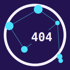
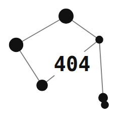
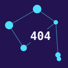
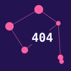
Same graph, rendered as a glowing sign — fluorescent racing-green, magenta, and cyan tube variants on a near-black backdrop.
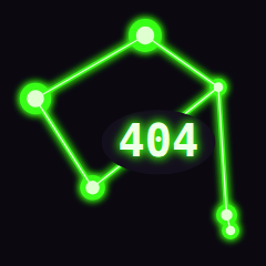
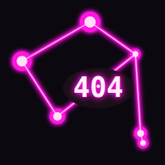
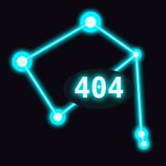
Full color everywhere doesn't survive a printer or a client's inbox — same brand, same voice, one leans into color/glow, the other leans harder on ASCII structure.
====), bracket fields, :: / ~/ notation carry the identity instead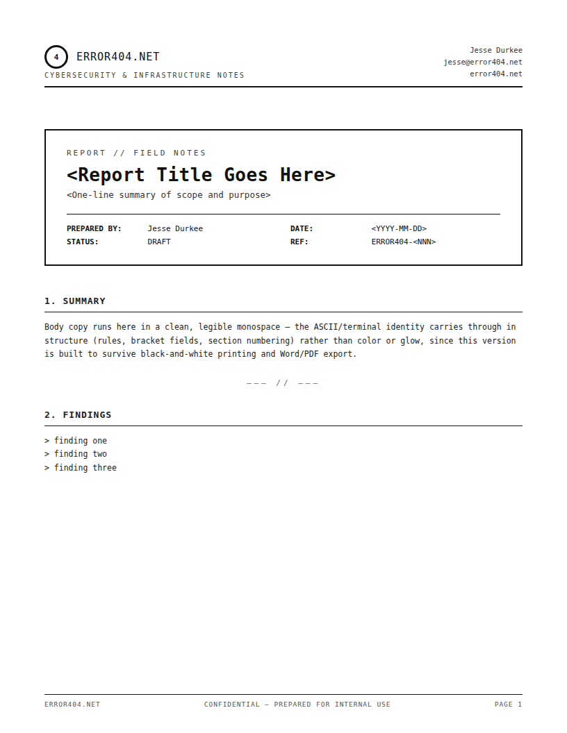
Print/Corporate mode, since email is functionally a plain-text medium.
<Your Name> ~/ <you@error404.net> :: <phone>
!ignore → return "404: Message not found"
Format shown above — the real signature (with your actual contact details) stays in your private guideline docs, not on the public site.